
Problem Statements
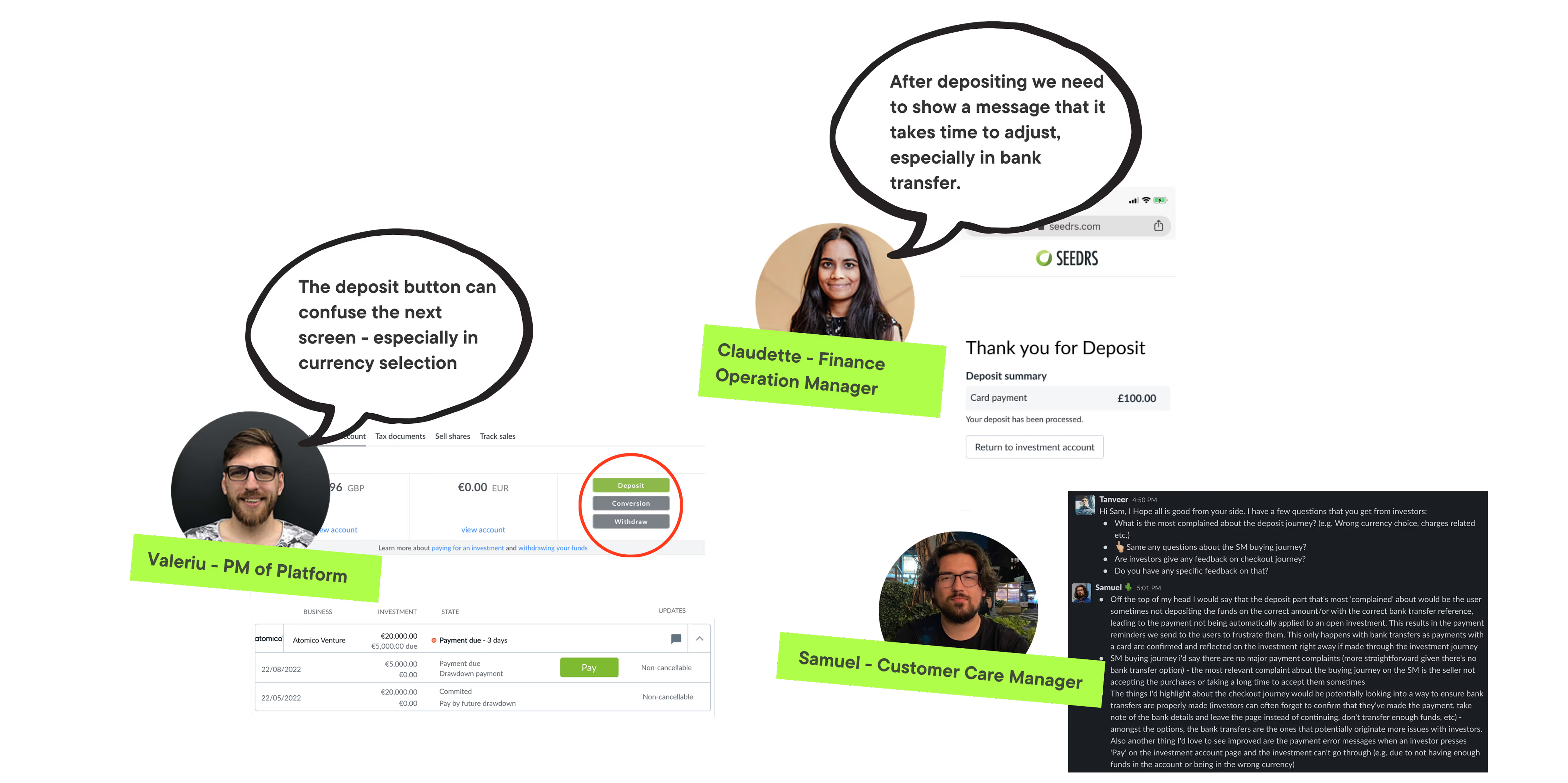
- Investor selects the incorrect currency and deposit. Then, reach out to customer care, which can significantly increase the ticket count.
- After copying bank reference & transferring money, forget to confirm the bank transfer and exit the deposit screen.
Solution
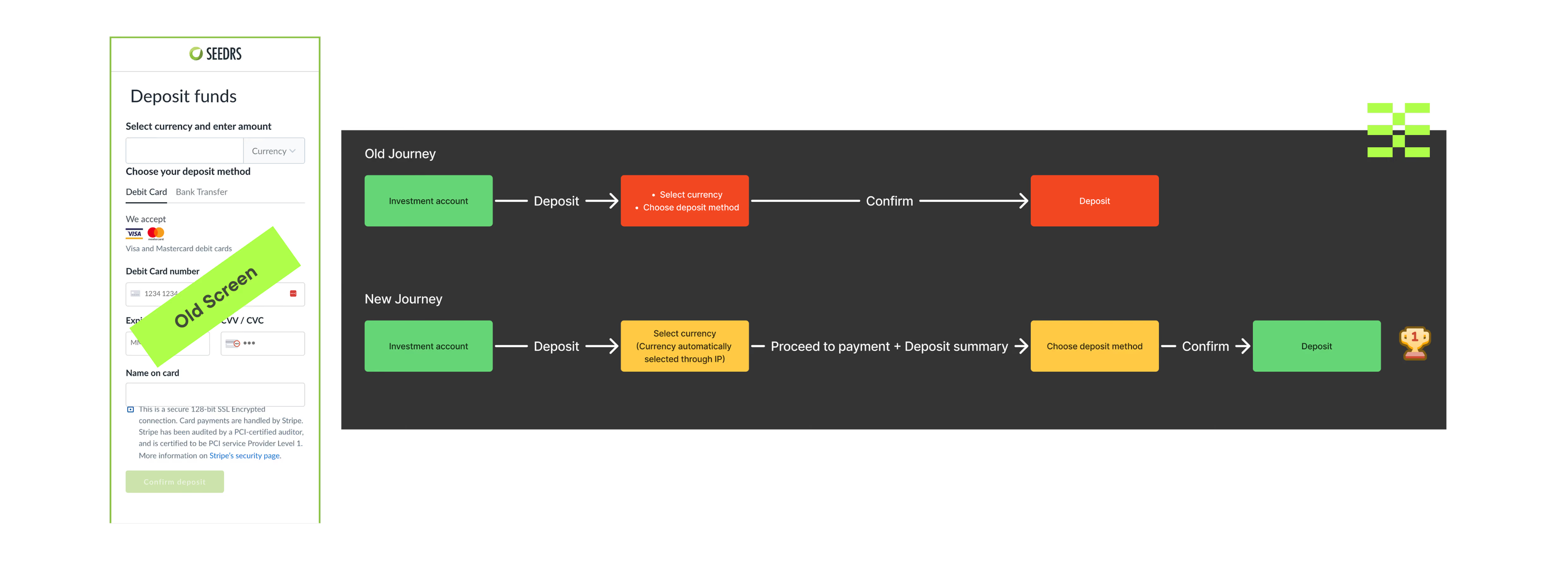
Created an enhanced user experience journey that simplifies currency selection and emphasizes a targeted deposit process.
Role
Product Designer
Tools
Figma
Responsibilities
Collect stakeholder & users Interviews and Insights, and UI.
Team Size
6
Key Stakeholders
- VP of Product
- Product Manager
- Finance Operation Manager
- Data Analyst
- Solution Architect
Time
3 Months
Method & Framework
A User-Centred Design Approach

Discovery Framework

Stakeholder Insights
User Insights
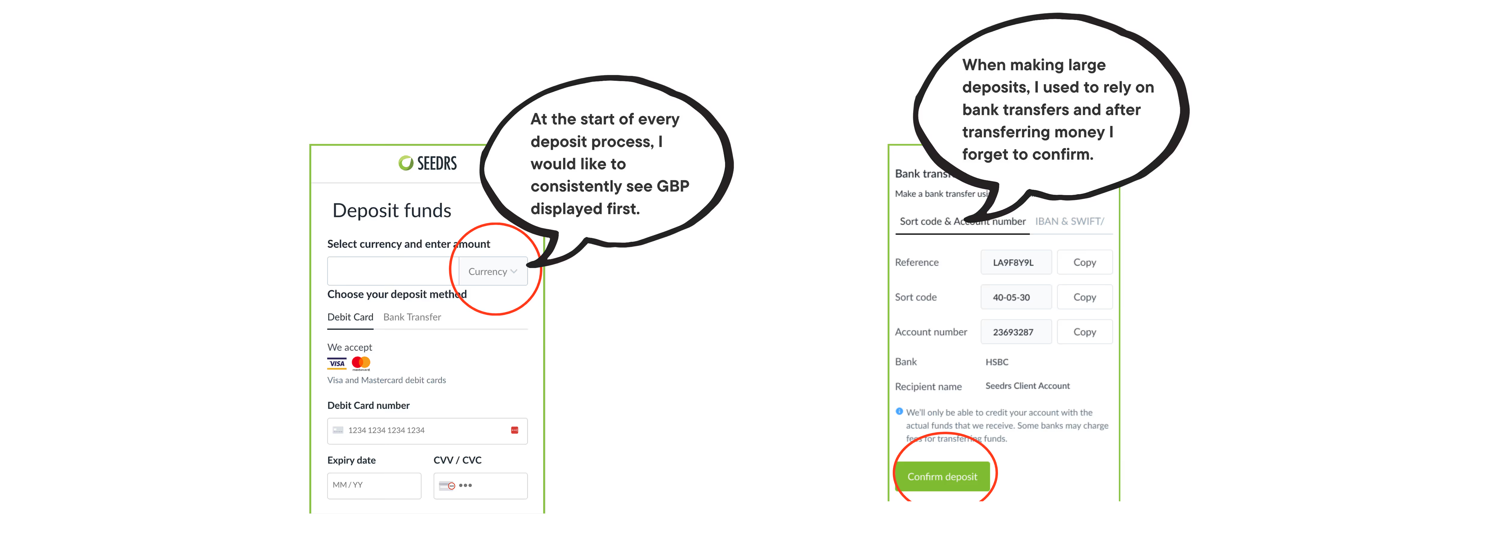
Select Currency Analysis
These two company is following the same pattern in choosing the currency & their monthly active user is quite significant.

User Journey
Final UI
Core journey of deposit : Debit Card

Core journey of deposit : Bank Deposit

▶️ Final Interactions
Please click on the link to have a better understanding of the user flow.
Impacts
- Since launching the new deposit journey, incorrect currency tickets dropped by 40%, as the currency is now preselected. Additionally, the investment amount ratio has risen by 10% compared to the previous quarter.
- With improved UX copy and separation of payment method, the rate of exits from the deposit screen has decreased by 30%.